Saturday, December 12, 2009

From Conception to Ingestion My Final Project

Click to play this Smilebox slideshow: Life of a pepper seed
Create your own slideshow - Powered by Smilebox
Make a Smilebox slideshow


Here is my final project I decided to do a story on the life of a pepper seed from conception to ingestion. This project was an eye opener trying to tweak all the pictures while keeping the basis of the original story line was a challenge. I am really glad that this was our assignment as it did require lots of planning and then using it to bring all the different things we learned during class together into one final project really made me feel far more comfortable with being able to perform the various picture edits and have the pictures make sense. Hope you enjoyed it as every year I greatly enjoy raising a couple hundred Chile pepper plants and turning the fruits of my harvests into wonderful mouthwatering concoctions.

Monday, November 16, 2009

Watermark


Here is my original picture taken off my balcony.


Here is the one with the watermark in it not as transparent as I would like it but it works.

Cloned


Here is the original picture of my son and my sister at my dads house.


And here is the modified picture were I cloned the carpet its not perfect but it was fun.

Friday, November 6, 2009

Dodge and Burn #2


 Ok here is the original picture far to bright all of the color of the picture is swallowed up by the light this is a time when you should not be going into the light.


And here is the edited picture and after a bit of burning your attention is focused on my little Christmas tree I left the tree far brighter than the background to make it pop and separate it from the woods.

Dodge and Burn #1


Here is my before picture the picture is over exposed and the beauty of the scene cannot be seen through the brightness of the picture.


And here is the same picture after burning the picture I burned the water more than the trees to accent the color of the sky I really think it came out much nicer than the original.

Saturday, October 31, 2009

Second color adjustments


So here is my other picture I thought this really brought out some real beauty to this picture all I did to achieve this look was to adjust the color balance to get rid of the shadows and brighten the picture then second I inverted the colors to give this effect I think it really makes the picture pop and looks better than it did.  

Color changes


So here is my before and after picture all I did was go into the Hue saturation and change the the Hue, Lightness, ans Saturation. Then I went in and changed the posterize numbers a bit to give it a real cool effect I think.

Saturday, October 24, 2009

Altered picture


Here is my altered picture I added my family to a jar of spicy pickled eggs.

Saturday, October 17, 2009

Landscapes


I was unable to pick one picture so I made a slide show of them hope you like them!!

Monday, October 12, 2009

Frames


Here are my frames or at least my pitiful attempt at frames sick as a dog and brain not working but at least I got them up. I had much better ideas in my head but I could not find the pictures that I wanted I know what my brain wanted to see but no matter how much i drove I could not find the perfect picture.

Rule of thirds


Here are my two pictures one has the sign dead center and it is just kind of boring your focus is on the sign and you miss the beauty that surrounds the sign. In the second picture were the sign resides in the right third of the picture there is more depth and beauty to the picture it looks like the sign is a piece of the nature and not stuck right out in the middle to slap you in the face.

Sunday, October 11, 2009

Photo composition and aesthetics

So after doing research on my own about composition and aesthetics plus what I learned about it from another class I have found this website that had some really nice information on it one of the things that I l;ike is the whole KISS philosophy and this site does just that it Keeps It Simple Stupid this is what it said
Composition guidelines are not our enemies but exist to help us. I think of them as tools and not rules. They originate from different arts, people, places, times, and ideas. Some common guidelines for nature and wildlife photographers include:
  • Don't center your subject unless doing so strengthens the image;
  • Arrange your scene so objects in the image guide the viewer's eye around the image. This gives you a small measure of control over how your work is viewed; and
  • Shoot in sidelight to reveal the texture of your subjects and add a 3D feel.
Experiment, have fun, and play with the guidelines! You may do something so innovative that you create a new guideline and retire an old one. Whatever you do, treat composition guidelines as what they are: tools and not rules.

It reminds us that although these techniques are tried and true they are simply guidelines and we should feel free to tweek them to fit the style picture we are looking for.  

Sunday, October 4, 2009

Different Times

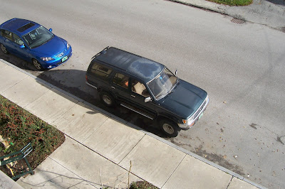
So here is the first of my pictures all taken at different times of the day I will update this post as the other pictures are taken first off I learned a very valuable lesson tonight I brought the camera inside to take pictures of what else but my overwinter chili garden experiment and I was on my way to the store at about 11 pm and I came across a once in a life time picture with the fog and the street lights that would have made a far better picture than the one I am posting but I left the camera at home and I have no way to get the pictures off my stupid cell phone and onto the computer yet. Also a good note when taking night time pictures with a extended shutter speed a tripod is very nice as the first twenty pictures I took the shake was so bad I had to go and dig out the tripod just to get one good shot.

Ok here is a picture taken first thing in the morning the sun is coming from the other side of the road and is just peeking over the mountain now. leaving the left side of the vehicle in the shadows.

This next picture was taken just prior to 10:30 when the sun had cleared the mountain and was actually shining showing a strong side light.

And finally this picture was taken when the sun was on the left side of the vehicle unfortunately it was completely blocked out by the building another issue when taking pictures and timing them around the sun you need to know the direction the sun travels and what is around that might mess up your shot.

Man trying to line up these shots each time was really hard thank god for the fact that they like to walk and left there car parked there all day.

This picture was a happy accident as trying to aim the camera in the dark when all you can see is dark is a bit hard I happened to do a test picture as a car came around the corner and this is what I got there was a little shake in the shot but other wise a cool shot none the less.

Friday, October 2, 2009

Complementary colors and analogous colors


So here is my first picture this represents complementary colors as green and red are directly across from each other.

This picture is a good representation of analogous colors as it combines yellow, yellow orange, orange, red orange, and even red all in the same picture. And of course if you know me at all you knew that this picture was coming. And yes just so you don't have to ask I am even more obsessed with chili peppers then you think I am.I promise that the next post will not be about chili peppers just to give yall a break from them but I make no promises about future posts.

Friday, September 25, 2009

Macro Pics


So here are my pictures this week being that we are supposed to have a frost tonight I had to do a bit of harvesting so I used the peppers for the pictures I was going to take the pictures while they were on the plant still cause I thought the added texture would be really neat but it was a bit harder than I expected because some of the pods were just deep enough in the plant they were hard to see plus it was cold out so I just picked them and brought them home were I could turn on the heat.

Saturday, September 19, 2009

My wild articholes


Here are my two pictures one is taken standing about 6 feet over the tops of these artichoke plants the other is looking up from under the plants. They are two very different pictures of the same plant. the first picture shows the beauty of the plant and all it color and grace (it was really windy)you can see the textural difference between the flower pedals and the surrounding foliage. The other picture shows the lack of grace and beauty that the structural support of these massive flowers have. Also i notice that the first picture is full of texture many different focal points and the second picture set against the blue sky gives it an almost two dimensional feel there is no real depth to the picture.

Monday, August 17, 2009

My ePortfolio

Here is the link to my ePortfolio man this was a fun project I am so glad that I did this It something that I will be able to use in the future if I should find myself in need of a job. Thanks for such a great class everyone was great thanks for helping me to get over my fears.

Self-Reflection Statement

In all of my work I created connections between my projects by picking a topic that means a lot to me something that I unfortunately have way to much knowledge in. I took that topic and carried it into each of my projects and every time I was able to elaborate on the subject by adding more information and having a stronger platform to present it from. I think that by using the same subject it gives me a chance to develop my skills to a level that I felt would make for a sound project that was informative yet interesting. If I had the time I would have made my ePortfolio format a bit different because although I enjoyed the layout of it, but there was more that I wanted to do. I was hoping to add some interesting color to the page as well as some background designs but know matter what I did it would not work the way that I wanted to. I was able to put a bit of a background on but not what I wanted where I wanted it. I organized my ePortfolio by making all of my pages in an organized fashion. I did this because it would allow people to better navigate my portfolio it allows the viewer to go directly to the topic of their choice then they can further there viewing by searching the sub-pages of each topic. I found patience to be the most effective technique in creating my projects. In the beginning I was trying to hurry my projects along and did not give them the time that they deserved. The thinking and planning process done before starting a project are directly related to the outcome of the project. I had a much easier time once we started doing the mind mapping and am glad that I was able to learn how to make them. When I first started working on the project I of blogging I really could not stand it I was always looking for the shortest blog post that I could make and still get my point across. But then later I became far more comfortable with the idea of people being able to read my blogs as you can see in the fact that towards the end, my blog posts were longer, more direct, and contained much less filler in them. The most difficult challenge in my ePortfolio was trying to include all the information from class and my outside sources but at the same time keeping the ePortfolio compact and to the point. I wanted to make sure that it was not to long because it becomes far to easy for a person to become bored and move on from your portfolio before they get the full picture of what you have to offer. Also it was a challenge to keep each subject clean from other subjects but at the same time tie them all together so they flow from page to page without seeing the same thing twice.

Monday, August 10, 2009

revalations & FATP

Well were to start this was one interesting week here making a video was really new to me and much more challenging than I thought it would be. So I used windows movie maker to do the movie and well its not all as simple as one might think it to be. For starters I next time would shoot a video the old fashion way going picture by picture was far from seamless. The transition from picture to picture well was just what it was a bunch of pictures put together to tell a story.

One of the biggest problems I had was for some reason a few overlayed words would not go away there came a time when I had to give up because the words just kept on popping up in places they were not supposed to be. The other thing that I had an issue with was the number of pictures required to make the video I know that if I was to do it again I would go out and take all my own pictures as searching for a CC picture that fit what I needed it to fit was a bit of a challenge.

Overall it was a great project and I am very glad that I was able to do it. I have learned a lot from this project and am ready to make many changes if I was to do it all over again. But for what it's worth this was probably one of the harder but more fun projects that we have done this whole class.

Here is my FATP

F Video
A Everyone that has a heart
T Heart disease
P TO educate

Video


Here is my video please enjoy.
This video is trying to bring awarness to heart disease. It should help people be more aware of what is going on around them.

All the photos were from CC and credit is due as follows:
http://www.flickr.com/photos/jazzlawyer/84291062/
http://www.flickr.com/photos/celebmuscle/1201974821/
http://www.flickr.com/photos/clintus/2297724702/
http://www.flickr.com/photos/atlnav/369536486/
http://www.flickr.com/photos/davefishernc/2431577209/
http://www.flickr.com/photos/stevegarfield/2504561841/
http://www.flickr.com/photos/prettydaisies/3199683520/
http://www.flickr.com/photos/maureencrosbie/3234141311/
http://www.flickr.com/photos/sshb/3337132613/
http://www.flickr.com/photos/pellegrini/15593716/
http://www.flickr.com/photos/asurroca/53759285/
http://www.flickr.com/photos/trommetter/2668468074/
http://www.flickr.com/photos/clintus/437900109/
http://www.flickr.com/photos/mikep/3594833091/
http://www.flickr.com/photos/chriswatkins/3179260186/
http://www.flickr.com/photos/chriswatkins/3179268348/
http://www.flickr.com/photos/saintmurse/110519067/
http://www.flickr.com/photos/nycarthur/437489623/

The music is from: http://kristinhersh.cashmusic.org/
"bamboo" written and performed by kristin hersh
published by yes dear music, bmi
produced by kristin hersh
recorded & mixed by steve rizzo at stable sound studio portsmouth ri usa

Wednesday, August 5, 2009

My Reflection

So another week down and this week was a comic and an animation both were very fun projects. I liked the comic because it was one that I was familiar with I used ToonDoo and I still love it. The fact that they make it possible for untalented people like me to make a comic strip using all the preloaded things is really cool the selection of stuff is very good and the fact that if you are talented enough you can draw your own things is really cool. After I figured out the theme of the comic it flowed together well and very fast.

For the animation that was a very fun project there was a bit of a learning curve to it as I was unable to find directions to it maybe they were there but I just missed them. I was not able to make the exact animation that I was going for because the characters could not make the movements that I was looking for. All in all it was a very fun project and I am glad that I was able to do it.

Monday, August 3, 2009

Exersice is good!!

GoAnimate.com: Exercise is good by vtpepper


Like it? Create your own at GoAnimate.com. It's free and fun!

Here is my animation.

Exercise kills

\exercise kills\


Here is my comic please enjoy.

Tuesday, July 28, 2009

My podcast reflection

So this week we did podcasts not my favorite thing. I hate listening to the sound of my own voice for starters as well as having other people hear how dumb I sound. Two of the things that I have hated all my life. Second so many topics to choose from it makes it harder to choose a good one I spent days trying to come up with a topic that I knew enough about to not sound stupid talking for 3 plus minuets. Third and most important the program that I used to make my pod cast was not user friendly as I kept making mistakes with one word and always towards the end I would mess it up and have to start all over at the beginning.

In the beginning of class I was so afraid of the weekly blogs because I always thought that everyone was laughing at me when they were reading my blog but I got over that because as far as I knew only class members were reading them. That all changed after I did my ToonDoo review and got a comment on it by one of the co-founders then I got scared again. But I can tell you that it's gone for good now that I have a podcast out there with my voice on it. I am not sure if I will ever do anything outside of class with podcasts until I feel more comfortable with my thought being out there for others to hear.

All in all I learned a lot through this project and enjoy pushing my boundaries. If I had it to do again I would have used a different program as the one I used really was not working well for me could not get the picture to load and on three occasions my saved audio file diapered causing me to have to rerecord it.

Monday, July 27, 2009

Podcast


Enclosed please find my podcast. This was a challenging assignment as for starters I hate talking on the computer or in general. second I had a bunch of problems loading it had to do it about 10 times the picture would not load up the audio kept disapering but I got it enough now. Hope you enjoyed it.

Sunday, July 26, 2009

Podcast review


Here is the Podcast that I chose for my review. It was called Scottish History Devolution.It is a really great Podcast if you are looking for information on Scottish History not as good if you were looking for a Podcast on fashion but I think the title of the Podcast will keep that in check. I have to say that the history lesson that I listened to was really informative as well as factual. I found myself wanting to go and listen to the other (or first) Podcast. The only complaint that I had was the two interchanging pictures on the Podcast were a bit boring, as well as the fade techniques used to switch between the two pictures were distracting from the audio. I greatly enjoyed the fact that the audio was done by a Scotsman as that led more towards the authenticity of the piece. All in all it was a very good well thought out and informatively educational piece. If you are interested in Scottish history you should listen to it as well.

Monday, July 20, 2009

The worlds best salsa?


Ok I know the slide show did not show here, but right above the picture part is a link to the original web page with the right slide show. I chose this one for an obvious reason it was an ok slide show. It showed a good relation of positive and negative space not so overpowering just the right amount of color the the black of the words and the white of the background. The tomato shot gives a great example of depth into the picture for instance. I also noticed a good combination of warm and cool colors to give each picture a nice rounded balance to them. That also could be contributed to the fact that most of the pictures included Complementary colors. Now this could have been made better some of the text is not correct and the directions are a bit vague as well as the fact that I can tell you that the title is a bit of a stretch as I have had hundreds of salsas and that particular recipe is not in my opinion the worlds best, or even something that most people would even be able to eat. As it for most people would be way to hot.

Sunday, July 12, 2009

Photo Composition


So the first three photos I love because they show a different point of view looking up from below. The picture are unique as they a side of plants people don't typically look at.


These next three show an extremely simplified background by blurring the background you are forced to look at what I want you to see and not get lost in the background.


These two photos for me showed a full frame also a bit of contrast the cloud one was one of my favorites(I did change the saturation a bit to make the clouds better).


This photo was one that I loved because of the lines on the dandelion pull you towards the center. Leading lines to be exact.


These three showed the rule of thirds.


These two show contrast with the colorful fireworks on the black night sky.


These last five show leading lines and They also create great depth as you follow the lines to the horizon.